As part of the big DC relaunch, DC put two of its most popular creators on one of the companies flagship titles. The creators are writer Geoff Johns and artist Jim Lee, and the book is the newest iteration of the durable "Justice League of America" franchise. Johns and Lee are both high-level executives at DC and had a major role in this whole rebranding/reimagining/rebooting of the DC line. But Justice League is the book that'll be demanding their full attention.
The book's cover promises a fairly unimaginative line-up of characters. The JLA has swung between having a roster of a 6-8 of the company's top characters to being stocked full of C and D level members. The best JL runs have had a good mix of icons and supporting characters. This time, DC went with 6 superstars (Superman, Batman, Wonder Woman, the Barry Allen version of Flash, the Hal Jordan version of Green Lantern, and Aquaman) and one supporting character (Cyborg, though even he has some mainstream recognition, having appeared on the Superfriends cartoon in the 1980s).
Now, the book's cover may show off 7 brightly clad superheroes, but the interior pages disagree. The issue features Batman and Green Lantern running afoul of both each other and an alien menace. Superman pops up at the very end, and a pre-superpowered Cyborg puts in a brief appearance as a bystander as Batman and Green Lantern do a flyby. As a comic fan of 18 years or so, I understand that a cover doesn't have to really tell you anything about a comic. But if I were one of those fabled new readers that DC is looking to snag, I'd be pretty pissed if half the line-up didn't even show up.
But let's talk about what actually DID show up in this comic. Geoff Johns delivered a straight-forward, mostly inoffensive script. Jim Lee, widely considered to be one of the greatest comic artists of the past 25 years, drew the hell out of the issue. It's not Lee's best work, but "meh" art from Lee is still frigging awesome.
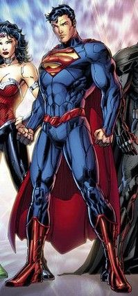
Where Lee falls down are in his character designs. In addition to being an exec at DC and the artist of this title, Lee designed (or co-designed, in some cases) the new costumes that each character in the relaunch sports. Lee's talents are in storytelling, not in design. Batman and GL, who get the bulk of the page count, have only minor, though unneccessary modifications to their standard looks. Batman's suit features more segmented plates, giving him a more armored-up look. It's not a look I love, but it does seem to be what mainstream audiences have embraced via the Batman films. GL gets away with only few stray additional costume details. Superman, making a one-page cameo, is the one who really gets the short end of the pencil. Lee's radical reinterpretation of Supes is made of fail. The guy is frigging invulnerable, yet his new suit is almost as armor-y as Batman's. Gone are the yellow belt and red underwear, which, to be fair, always were objects of ridicule.
The bigger Superman sin belongs to Mr. Johns. In Superman's brief appearance, he punches GL through a building for no reason, and then asks Batman, "So...what can you do?" This suggests Mr. Johns either doesn't know how to write Superman, or decided to take this 1st issue to establish Supes as a thug who likes to get into veritable cock-measuring contests with other superheroes. Neither of these options are particular attractive.
Will I buy the next issue: Not looking good. Great art can't save an uninspired script and crap character work.
No comments:
Post a Comment